Where you stand out.
Rebranding is bold. Courageous. Confident.
And when employees personify the brand, it’s authentic.
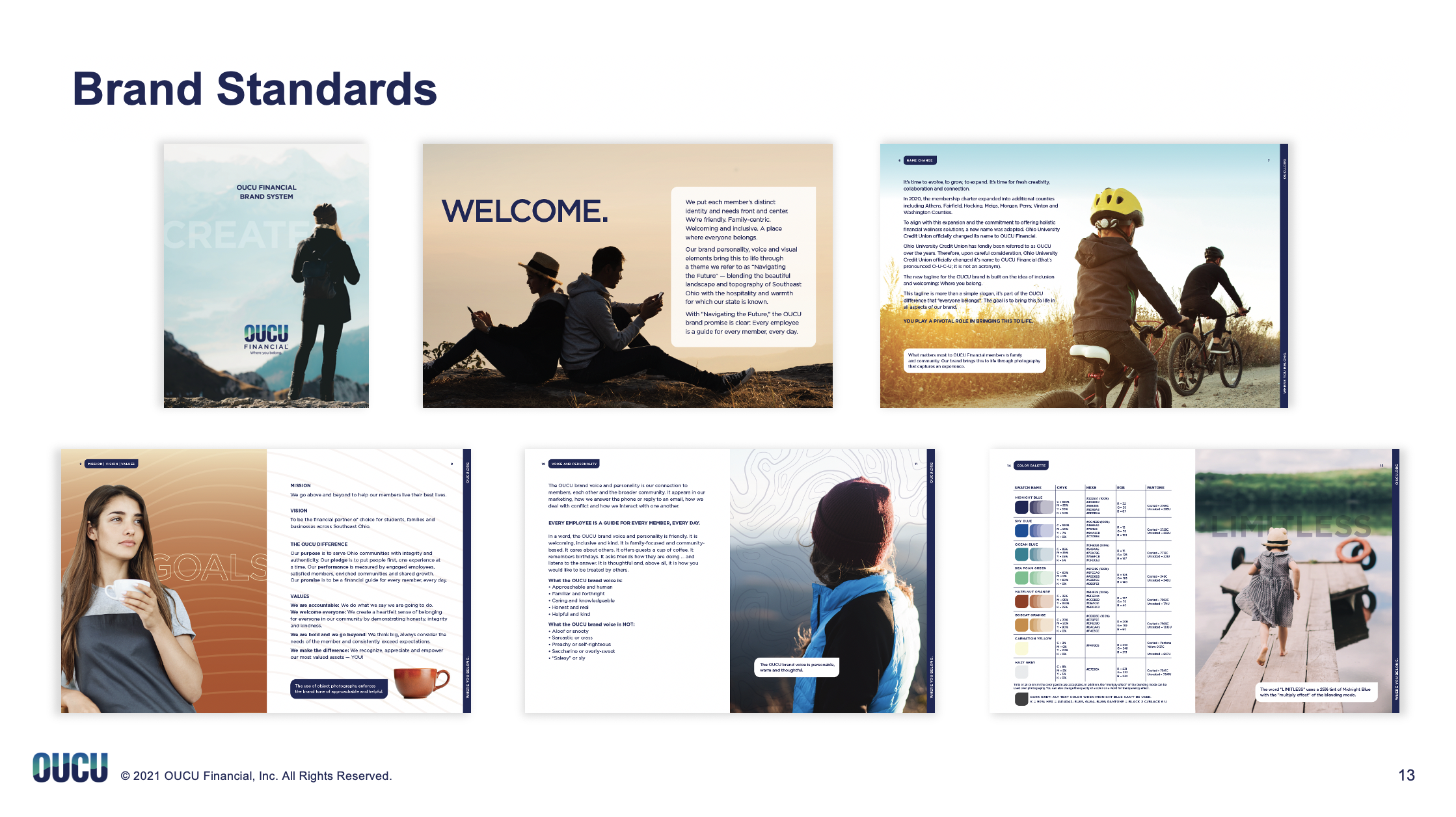
The OUCU brand promise is clear: Every employee is a guide for every member, every day.
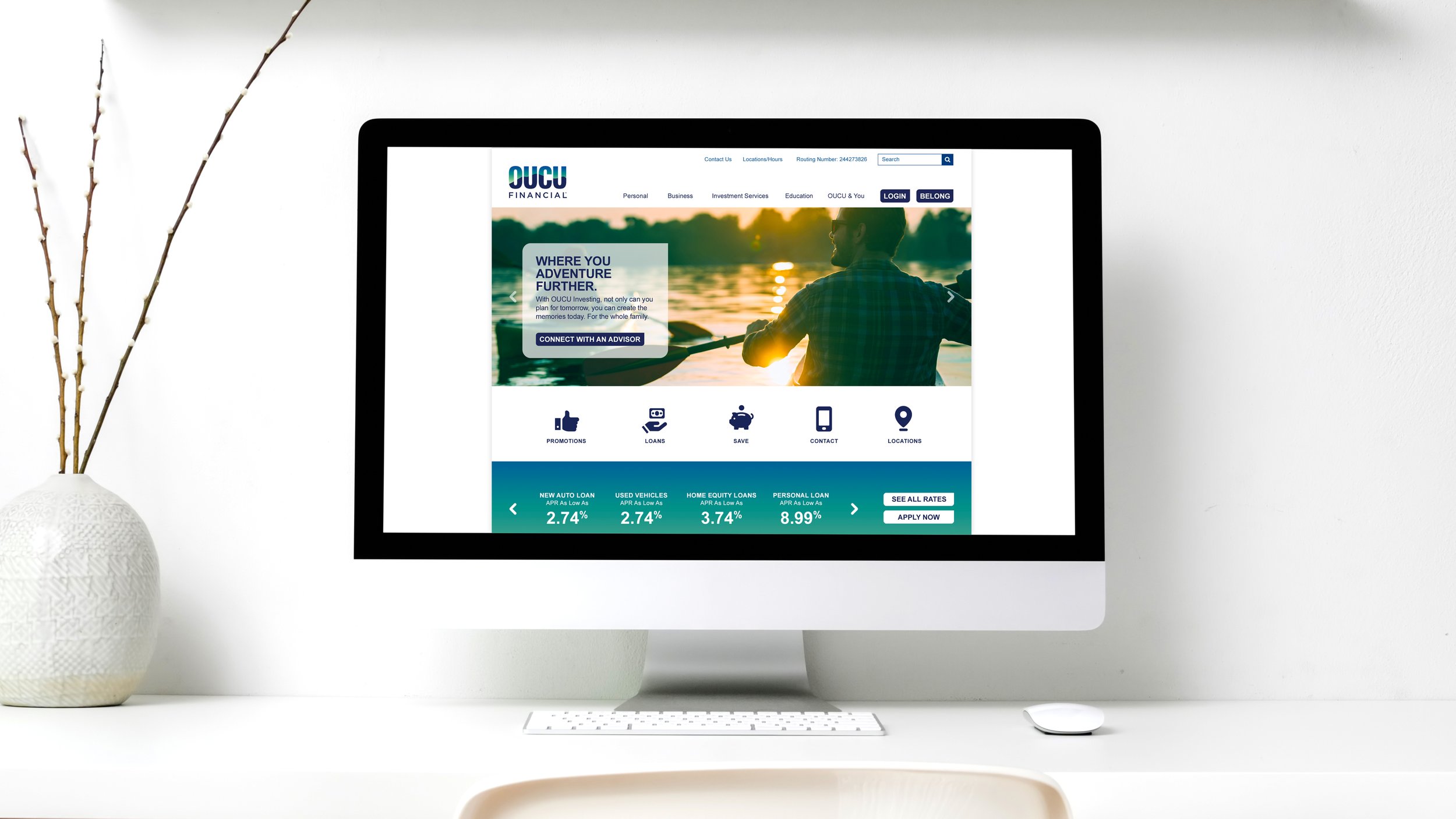
OUCU Financial. Where you belong.

(Old name and logo on the left. New name and logo on the right.)
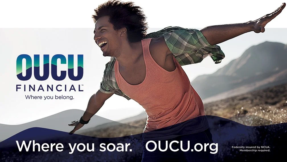
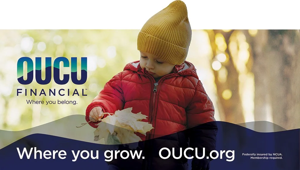
Making the logo more personal, inclusive and welcoming was the goal. The brand personality, voice and visual elements bring this to life through a theme referred to as “Navigating the Future” — blending the beautiful landscape and topography of Southeast Ohio with the hospitality and warmth for which the state is known.
OUCU Financial is a partner — where you are a member, not a customer.
Where you belong.


